
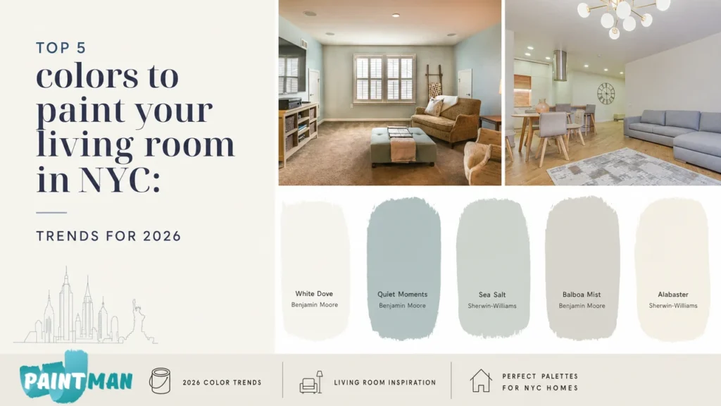
Choosing the right color to paint your living room may sound easy, until it comes to choosing between beige and grey. One tone can make your living room feel like home, while the other one, distant and lonely. If you want to learn about the top 5 colors to paint your living room in NYC, here are our expert recommendations: White Dove by Benjamin Moore, Quiet Moments by Benjamin Moore, Sea Salt by Sherwin-Williams, Balboa Mist by Benjamin Moore, and Alabaster by Sherwin-Williams.
The color you choose doesn’t just set the mood. It can make the space appear small or huge. It can affect the brightness and even make the furniture and decor look decent or completely out of place.
Speaking from experience, at Paintman NYC, we’ve surprised homeowners in condos, apartments, and brownstones with just how much the final paint color can transform a room.
Why Choosing the Right Living Room Paint Color Matters
You may choose the perfect paint shade for your home based on a picture or the shade card you’ve just seen. But once it’s on the wall, it can suddenly look off.
This happens often because very few people realize that a color that looks amazing in Texas would fall flat in an apartment in NYC. Paint reacts to the architecture, light, ceiling height, the furniture, the floor, and even the surrounding buildings around your apartment or condo.
Never choose the wall paint shade from a paint chip alone. Here are three pro factors to consider when making the choice.
Natural Light
The biggest factor that affects how the paint will look on the wall is how much sunlight you are getting. If your living room is not facing the sun, it most likely receives cool or bluish daylight. This can make cool grey paint look colder, so the room, instead of looking welcoming, feels kind of sterile.
The same paint color and tone can look dramatically different even in apartments on the same block.
Small Spaces
Most homeowners in NYC have small spaces. This becomes a limitation for dark tones. Dark colors may work for small spaces, but only when they have the right light balance. Otherwise, shades like deep navy or charcoal grey can make the walls appear closer and the room even smaller.
On the contrary, lighter shades reflect light and give the room the illusion of a large, open space.
Open Floor Plans
An open floor plan or open concept layout is another challenge in choosing the shade. The wall color does not work in isolation. It has to interact with the cabinets, countertops, flooring, and even the adjacent walls.
So you need a color that can adapt to the room. The color that works well with natural sunlight as well as the evening lamp light. In most cases, warm neutrals like greige and soft off-whites can be good colors to paint your living room.

How to Pick Paint Colors for Your Living Room in NY
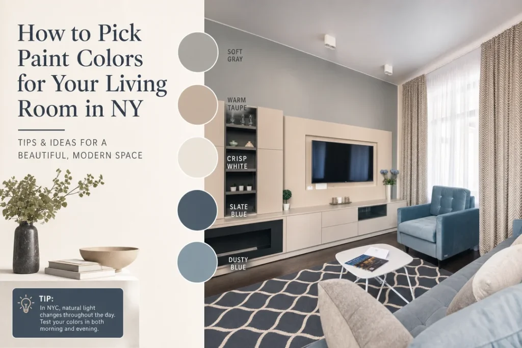
It’s tempting to go for a wall paint color you see in a photo on Pinterest or Instagram. But that can be a costly mistake. Here’s how to choose the right paint color for your living room:
- North-facing Living Rooms: The indirect sunlight has cool undertones, so go for warm neutrals. Popular colors are warm white and light taupe.
- South-facing Living Rooms: Since sunlight is mostly consistent, you get more flexibility to choose the shade for south-facing rooms. You can go with colors like sea salt and muted pastels.
- East-facing Living Rooms: Sunlight is usually brighter in the morning than in the evening. Balanced neutrals and warm tones are recommended.
- West-facing Living Rooms: These are cooler in the morning and get warm by the evening. Cool neutrals and balanced tones usually work with these.
- LRV: The Light Reflectance Value (LRV) tells you how much visible light the paint color reflects. Colors with high LRV can make small spaces look bright. For instance, White Dove has an LRV of 83.16, which makes it ideal for small-sized living rooms.
- Flooring and Furniture: The flooring, stone surface, cabinets, and furniture are often the permanent features of the room. The wall color you go with must not fight these existing finishes.
Top 5 Colors to Paint Your Living Room in New York City!
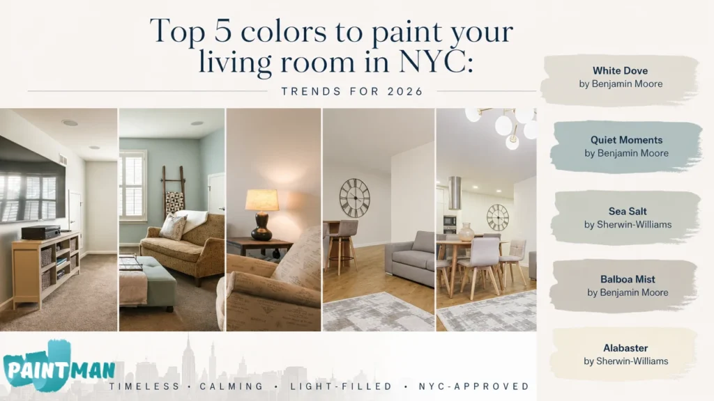
Here are the top 5 colors to paint your living room in NYC that we found consistently outperforming the trends and can also complement a range of furnishings.
White Dove OC-17(Benjamin Moore)
Benjamin Moore’s White Dove (OC-17) works best for Manhattan apartments, especially the pre-war homes. The color complements the open floor plan and widens up the room, making it look well-lit and inviting.
It works best in small-sized apartments and is a timeless classic.
What We Like About It
- Soft warm white
- Doesn’t feel sterile
- Has excellent light reflection
Drawback
- It can look creamy with modern finishes.
Quiet Moments 1563 (Benjamin Moore)
If you are avoiding dark or harsh color tones, Benjamin Moore’s Quiet Moment 1563 has a soft blue-green tone. It has a more spa-like appearance, which can give the room personality while staying neutral.
The color works best for large-sized living rooms or homes that get abundant natural light.
What We Like About It
- Soft and calming
- Feels airy
- Adds subtle color while being neutral
Drawback
- Can feel slightly cool in north-facing rooms
Sea Salt SW 6204 (Sherwin-Williams)
Sherwin-Williams Sea Salt (SW 6204) is a blue, green, and grey blend. The color creates a calm atmosphere in the room without overpowering it.
What We Like About It
- Works best with coastal and neutral interiors
- Subtle like neutral shades
- Goes well with white trim and soft textiles
Drawback
- Doesn’t shine well in low lighting.
Balboa Mist OC-27 (Benjamin Moore)
Benjamin Moore’s Balboa Mist (OC-27) balances the beige and grey tones that adapt to the sunlight coming in throughout the day. The color looks sophisticated and is versatile, but unlike other cool tones, it does not feel cold.
This is our top recommended option for north-facing rooms and living rooms with hardwood floors.
What We Like About It
- Designer’s favorite classic
- Has flexible undertones
- Works with modern as well as traditional decor
Drawback
- Can appear grey or beige depending on the lighting
Alabaster SW 7008 (Sherwin-Williams)
Sherwin-Williams’ Alabaster (SW 7008) is another timeless classic warm white shade. The color appears soft and creates a welcoming atmosphere in the room. If you are looking to renovate a family living room, especially in a south-facing apartment, the color is your go-to.
Many people often confuse this tone with White Dove, but alabaster is slightly warmer and has a soft appearance. Whereas White Dove has a cleaner and brighter tone.
What We Like About It
- Feels inviting
- Calm and cozy
- Great for open layouts
- Works well on both walls and trim
Drawback
- May look yellow-toned depending on the surrounding finish

Choose the Best Colors to Paint Your Room with Paintman NYC
The best paint shade isn’t necessarily the one that’s trending on Instagram. It’s the one that works best with your apartment size, lighting and lifestyle.
So if you are looking to personalize your space, Paintman NYC can help you choose the color that best fits your home. We will make sure the walls complement the lighting, furniture, floors, and your decor, and everything else before our brush touches your walls.

Mychal Diachenko
Mychal Diachenko, Author at Paintman NYC blog. Started Paintman NYC company and has been painting for more than 10 years throughout Europe and New York City. Since 2017, he has created a family-run painting company that people trust and that is recognized for doing a great job painting apartments all around New York.